PandaDoc is an all-in-one document automation software that helps businesses streamline their document workflows. It allows users to create, send, track, and eSign documents all in one place. With PandaDoc, you can create proposals, quotes, contracts, and other documents quickly and easily using customizable templates. You can also integrate PandaDoc with your CRM system to pull customer data into your documents fast.
The analytics reports in PandaDoc. A powerful tool to improve your workflow.
PandaDoc offers a variety of analytics reports that can help you track the performance of your documents and understand how your recipients are interacting with them. These reports can be customized to your specific needs and can be exported to CSV files for further analysis. Some key analytics reports that PandaDoc offers include:
- Document efficiency: This report shows you how long recipients spend viewing your documents, how many times they view them, and whether they download them as PDFs. You can also see which pages of your documents are the most popular and which ones are being skipped.
- Template efficiency: This report shows you how well your templates are performing. You can see how many documents have been created from each template, how long recipients spend viewing them, and whether they download them as PDFs.
- Leaderboard: This report shows you which of your team members are sending the most documents, getting the most views, and closing the most deals.
- Activity log:This report shows you a detailed history of all the activity that has taken place on your documents, including when they were sent, viewed, and downloaded.
How to access the analytics section of PandaDoc.
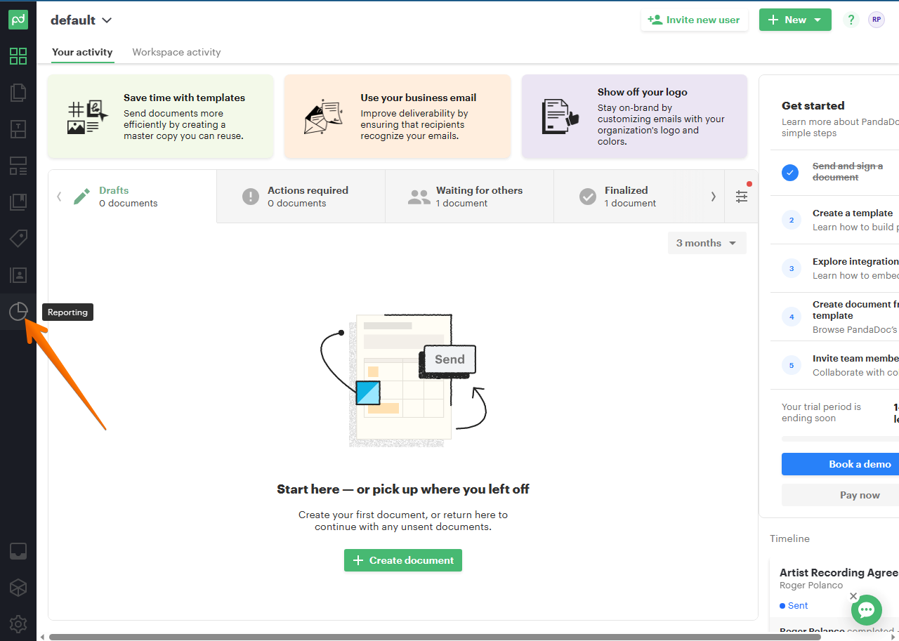
The first thing you have to do is to go to the PandaDoc Dashboard. Once there, please look on the left side menu. You must scroll down to the last box and click on it. The icon in the menu is in the form of a circular diagram.
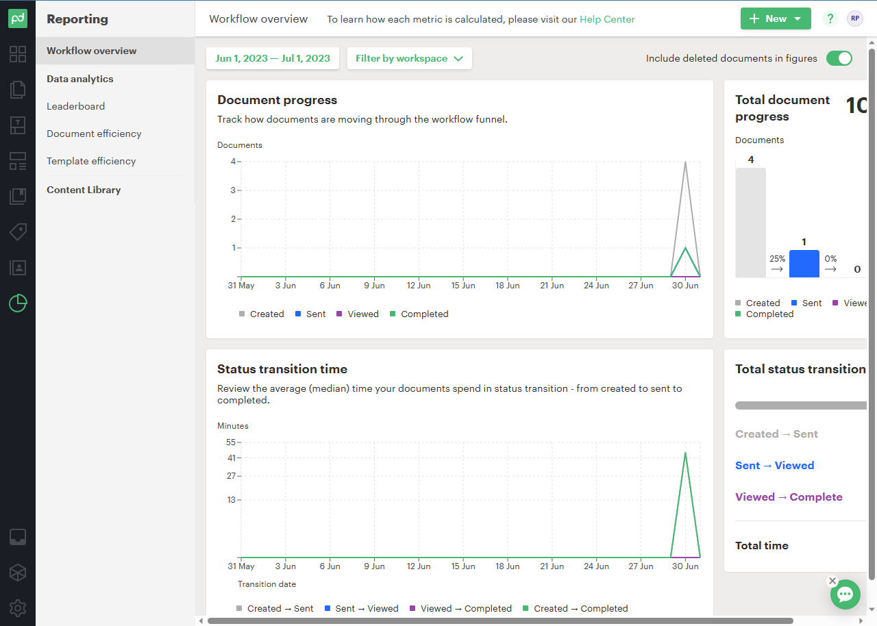
By clicking, you will be redirected to the first section of the analytics. There, in the Workflow overview, you can see the behavior of the documents through the workflow funnel. That is, the progress of the documents. Additionally, you can filter the time span to display the info: by day, week, month, year. You can even customize a specific time span. This metric is beneficial for estimating the number of documents worked over time. In the second graph, we can see the average time your documents spend in status transition—from created to sent to complete. In this way, it is possible to determine which documents have been worked successfully and during which period of time.
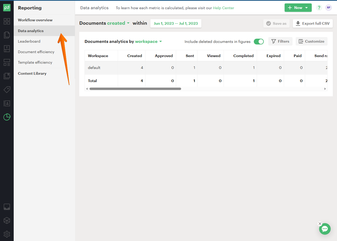
The second section corresponds to data analytics. As the name suggests, the tool displays all Workspaces, the total number of documents, including those deleted. It is a section full of data, so it is worth scrolling to the right on the slider bar to see all the data obtained. This data is relevant to determine the actual status of the workflow. As in the previous section, you can discriminate the presentation of data according to a specific time span.
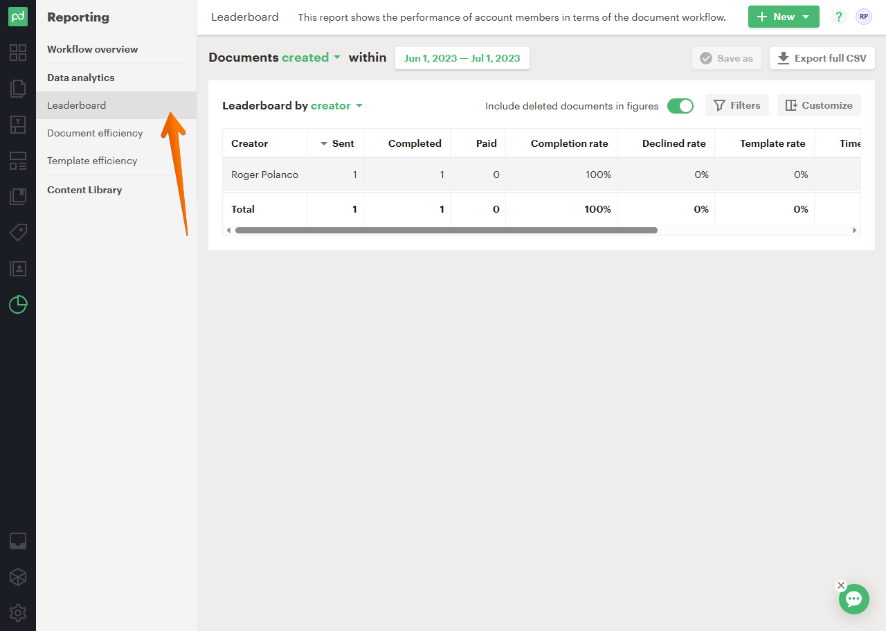
Below is the leaderboard. From here you can determine the degree of effectiveness of the authors with respect to the number of documents produced. There are very valuable statistics, including for example the value of the documents generated. As in the previous section, you can discriminate the presentation of data according to a specific time span.
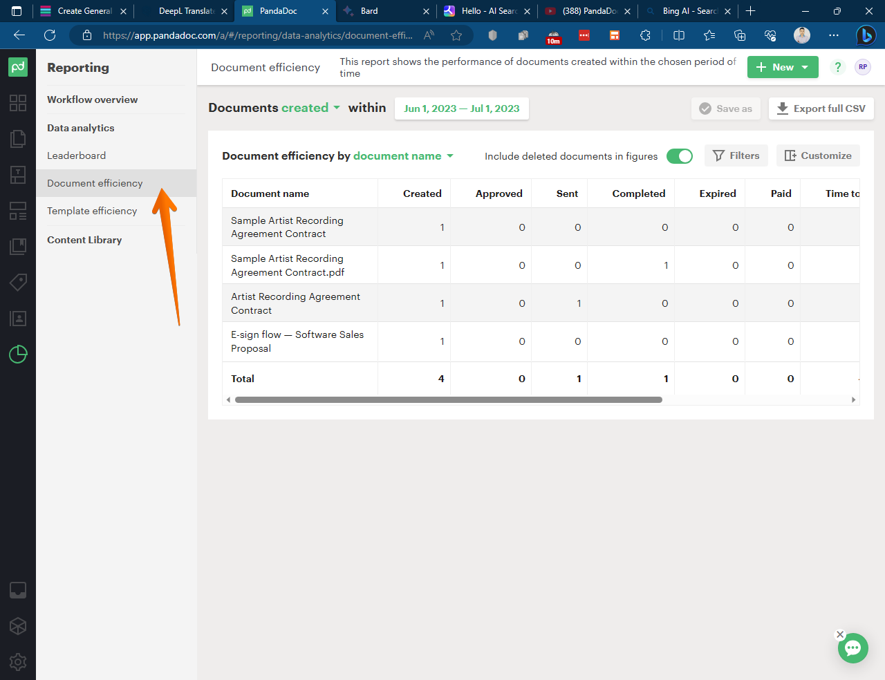
The following statistics show the efficiency of the documents. That is, what is the success rate of each one of them according to the status reached. We will be able to discriminate this data according to its name, workspace, template, or creator. The interesting thing is that you can look closely at the metrics of each specific document.
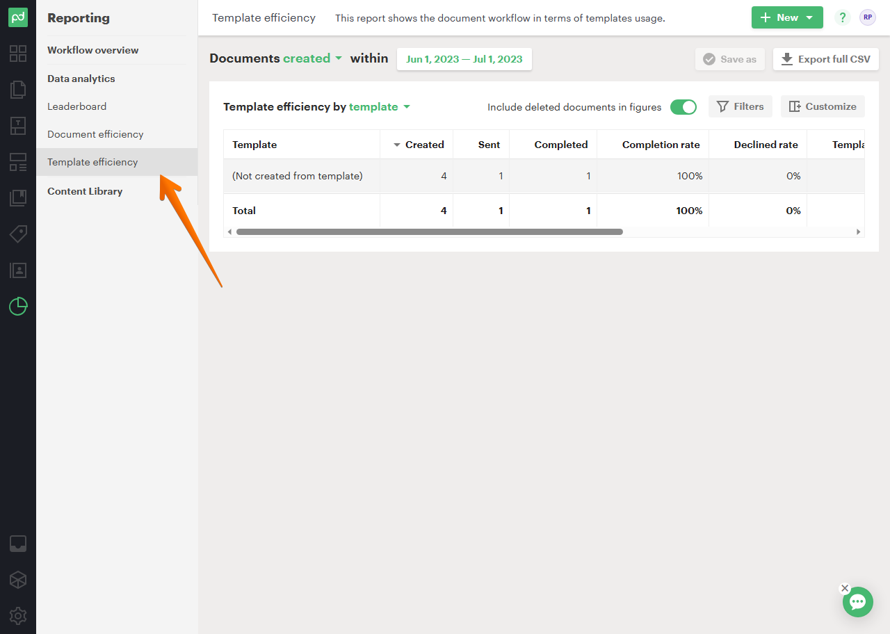
The following section establishes the efficiency of the templates. That is, a statistic equal to the previous one, but this time discriminated according to the template used. You can also refine the sample by template, creator, workspace, and document name.
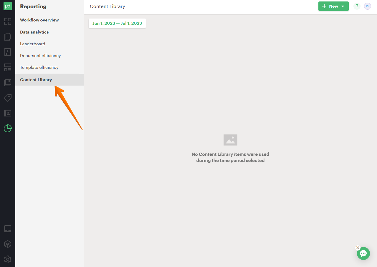
The latest available metric corresponds to the Content Library. From there you will be able to observe the data related to this element.
As you can see, the reports section is very useful to view and analyze the metrics of the documents managed by PandaDoc. Additionally, it is a powerful tool to measure the effectiveness of your team.